- Node Mode
- Posts
- They're Not Details, They're The Experience
They're Not Details, They're The Experience
The cherry on top makes the cake
Aydıncan Ataberk
May 18, 2025
Morning everyone 👨🎨
Welcome to this Sunday’s essay. Hope you enjoy 😇
↓ Level 1: The things we postpone as "details" during product design actually make up the entire product experience
↓ Level 2: These micro-interactions aren't just nice touches—they're messages that speak to the soul of the product and the team behind it
↓ Level 3: Eventually all these micro-interactions create hard-to-copy experiences that help users form deep connections with products and convert into customers
"Oh, those details—we'll figure them out later down the road." You might have heard (or said) something like this in a product design session. Those postponed "details" are actually the micro-interactions that make up the entire product experience. Think subtle animations, delightful illustrations, audio feedback, or satisfying haptic responses. Most of the time, in most companies, those details we plan to "get back to" never actually get the attention they deserve.
Yet in game development, this phase has a defined name and timeframe: Polishing. Polishing is sometimes applied in early stages, sometimes at the end of the development process, but it's always applied and is a crucial part of a good gaming experience. Screen shake when you fire a weapon is the classic polishing example in shooter games. But when a bigger weapon produces more screen shake, it signals a more deadly weapon—making polishing sit somewhere between game feel and game mechanics. Despite the game industry having such a defined phase, digital product design and development doesn't have an equivalent. But it should.
The demo below from 12 years ago perfectly illustrates what polishing does to a game:
Perceived Quality Heuristics or the Halo Effect
Let's start with physical products—specifically automotive, where competition is fiercest. Premium cars have that satisfying sound when you close the door. That rich, full bodied, air-sucking, bass-toned "thud!" Auto manufacturers work with specialized sound designers after designing the entire car to perfect that door feel and sound. This field even has a name: "psychoacoustics"—the study of psychological, cognitive, and sensory responses associated with sound. And it greatly affects perceived quality of a car.

Door handle of a Model Y - Credit: Eyosias G
The primary reason for the attention to doors is that cars are first encountered in showrooms, and this is the very interaction that creates the first impression. After the initial exterior appearance, that "premium" sound from the door influences both the purchase decision and subsequent usage experience of a potential customer. Maybe this is why Elon Musk, who obsesses over Tesla's design, also spent countless days and hours working on Tesla's door handles (Now self-presenting when approached by its owner). Rather than being "a maniac obsessed with details," we can interpret this as someone obsessed with the total experience—which is the point and main thesis of this essay.
For industries where post-release updates aren't possible, this isn't new territory (Speaking of Tesla it is possible). An AirPods case snapping shut with that perfect magnetic click as it approaches closure, or opening with just a slight finger movement and that satisfying flop—that's definitely not accidental.
Looking at psychology, this concept's foundations go back to the 1920s. American psychologist Edward Thorndike conducted experiments on mental shortcuts that lead to quick judgments and defined what he called the Halo Effect. According to Thorndike, the halo effect is the tendency to form general impressions based on specific inferences. This explains why attractive people are often perceived as more intelligent or trustworthy at first sight. If you haven't seen it, you can watch a very popular version of a similar test in the first episode of Netflix's "100 Humans" series, "What makes us attractive," in a test about crimes.
Perceived quality heuristics stem from the halo effect and are based on the principle that people use mental shortcuts to make quality judgments. When we experience something with attention to detail in areas we can see or feel, we subconsciously assume similar care has been taken in areas we can't see.
Why Details Aren't Just Details
In 2008, Loren Brichter left his job at Apple to become an iOS developer and released a Twitter client called Tweetie. While designing the refresh function for the app where seeing current tweets frequently was important, Brichter noticed that existing experiences were quite boring and designed a completely new refresh experience called "pull-to-refresh" for Tweetie. The intuitive interaction was instantly loved by users, and is now a default behavior defined on phones today.
Let's move from Twitter to other community apps. We can define “notifying a group when a new user is added” as a pure functionality. But if your target audience is gamers, you can design this function with DNA-level micro-interactions. That's exactly what Discord did. A new user doesn't get "added" to a Discord server—they "spawn."
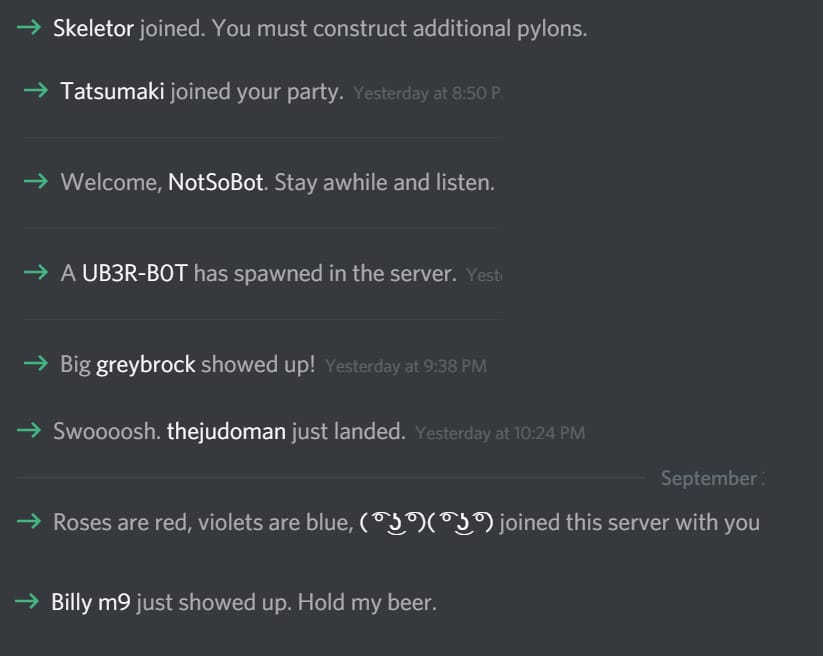
Discord’s new member messages
This spawn action appears in the message feed with playful messages like "A wild Jonathan has appeared." Discord also gives spawning new server members a chance to say an animated hello with a "Say hello" button right at their fingertips, doing everything possible to turn gaming communities (which can be toxic) into a warm home.
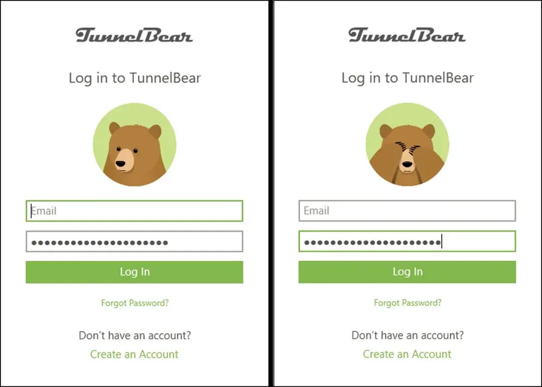
Now Discord is already a fun product targeting gamers. Let's look at another example—TunnelBear, which differentiated itself in the extremely boring utility market of VPNs. When you select the country you want to connect to in TunnelBear, a bear from your current country dives underground like a groundhog and pops its head up from the country you want to connect to. A wonderfully enhanced, sweet way to give that "I'm here now" feeling.
I’m not looking…
The same little bear also covers its eyes when you're typing your password. This is the complete experience developed by an app focused on anonymity to emotionally connect with users and stand out among the world's most boring products. We could go on with examples endlessly, but let's pause here and formulate the core concept.
What Is Product Experience According to the Author?
The secret of the experience concept is that it contains temporality. An experience can last a moment, a few hours, a few minutes, or a lifetime (the human experience). When we’re discussing an experience, we must acknowledge all its perceived elements within a time frame and the emotions that formed around it. Emotions over time create experiences. Emotions are a cognitive life function for humans. We learn, understand, and survive through emotions. The things we experience shape us and affect our future decisions. Of course, not every experience will shape us. Experiences exist on a spectrum according to their emotional power. One end of the spectrum is transformative experiences (e.g., emotional traumas), while the other end is ordinary daily experiences (like plugging the USB thing the wrong way, every time).

Nope. Nope. Nope.
A product, whether designed or not, provides an experience to its user. The experience could be perfectly handling a task, or it could be a set of interactions like Tinder's swipe that redefines human love relationships. How deliberately the product experience is designed affects the overall quality perception and determines whether you produce users who "love" or "hate" you. Just like the halo effect in physical products, in digital products, polished interactions signal that developers care about the user experience, which builds trust in the product's overall quality and reliability.
Layers of Product Experience
To make the article a little more actionable, let's break down product experience into 4 layers and try to identify where we're falling short in the products we're responsible for.
Functional layer
Which means solving a problem very well. In the world where innovation against needs is becoming increasingly difficult—where every problem has a solution—we don't even talk about this layer anymore. However, as of 2022, LLMs (ChatGPT and similar) that entered our lives brought a magical functionality we hadn't seen in a long time, so we can include them in this category (like instantly converting your shXXXy email into excellent business English).Usability layer
How usable the product is, generally the area that UX discipline focuses on along with the above. Why is it important? Because a button that doesn't work properly during money transfer can cause us to abandon an entire bank—with its treasury money, thousands of employees, and 50+ years of brand investment.
“Send”
Emotional layer
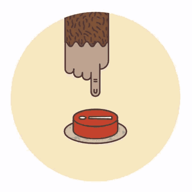
The feelings it evokes in users and the connection formed with users. In addition to the examples I mentioned above, we can add MailChimp's sweating and trembling gorilla finger animation over the send button before sending newsletters to thousands of people (though it's no longer there, it best illustrated this concept).Identity layer
The product and brand identity built from the total experience of all interactions combined. This is the layer that subconsciously gives users the message that they are or aren't in the right place. You can design this layer openly or subtly. But whether you design it or not, it will be built as a result of the product experience.
In the product world, excellent work is done on the first two layers almost all the time. However, the last two layers, naturally which are difficult to measure and define as success criteria, don't get much work. As I said at the beginning, there's no defined polishing phase in the product design process. While usability improves through constant testing and iterations, it can develop by chance with a single designer's initiative. Real polishing, in the sense I referenced from video games, still doesn't exist in the UX/Product design process.
Make Time Because This Is Exactly the Work
When we bring up the polishing idea, we might face defense mechanisms with arguments like resource constraints, download or sales numbers and other “priorities”. Like, let's first get lots of people to our site and sign up, then we'll think about polishing it. But the mistake is exactly here. To truly win that user who came or took the trouble to download the app—that unique, incredibly valuable, that precious user—and convert them into a future customer, you can only do so by designing the complete experience.
So first, let's acknowledge that 1- everything you've defined as "those details, we'll look at later" is a phase in product design, and 2- it concerns founders too because of its potential to convert users into loyal customers. Then let's add the "polishing" layer into design process. You can start working on this tomorrow for a feature you're planning for the next release. Let's see what effects it will have.
Bright Minds
Susan Kare, “The Woman Who Gave Macintosh Its Smile”. Susan Kare designed all the icons, animations, important typefaces, and graphic elements while working on Macintosh in the '80s, creating what now forms Apple's DNA codes. Paola Antonelli, curator of the 2015 MOMA exhibition held in her honor, said: "If the Mac turned out to be such a revolutionary object—a pet instead of a home appliance, a spark for the imagination instead of a mere work tool—it is thanks to Susan's fonts and icons, which gave it voice, personality, style, and even a sense of humor."
Time Capsule
First Amazon 1-Click Patent September 12, 1999: Amazon received a patent for "one-click purchasing"—perhaps the most effective micro-interaction in e-commerce history. This seemingly simple feature reduced three pages and 58 seconds of checkout process to a single click. Amazon.com also owns the "1-Click" trademark.
Tiny Challenge
Spend 5 meditative minutes in your favorite app. Take a notebook and observe only the micro-interactions. Note every touch, every animation, sound, and visual feedback. If you don't mind the effort, you can send me your notes afterwards.
Node Mode [Off][ ]
Peace,
Aydıncan.
Reply